Responsive Breakpoints
Responsive breakpoints are SCSS (or SASS) mixins that not only change the breakpoints for various Tailspin classes and utiliies, but can also be used in additional custom SASS based CSS along side the Tailspin library. If another library or framework is used that supports responsive design, such as Bootstrap, the additional library or framework is not affected by Tailspin's responsive breakpoints.
Resize the browser to see responsive breakpoints in action.
Depending on the breakpoint mixin used, both a dekstop or mobile first approach are supported.
The definitions for desktop first breakpoints are created by using a mixin name that is appended by max, and the mobile first breakpoints are created using a mixin name that is appended by min.
There are 8 breakpoints available. Use the mixins in any custom SASS based CSS.
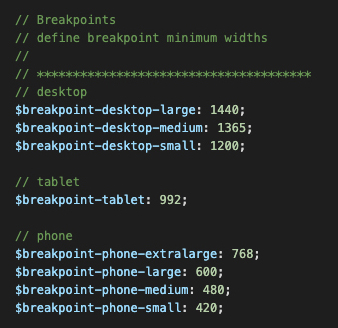
Desktop first
Max-width, the given screen size or smaller.
.custom-class {
background: red;
@include breakpoint-max(tablet) {
background: green;
}
@include breakpoint-max(phone-xlg) {
background: blue;
}
}
Mobile first
Min-width, the given screen size or larger.
.custom-class {
background: blue;
@include breakpoint-min(phone-xlg) {
background: green;
}
@include breakpoint-min(tablet) {
background: red;
}
}
Code
<div class="responsive-breakpoints">
   Resize the browser to see responsive breakpoints in action.
</div>

Custom desktop first SCSS using responsive breakpoint mixins

.responsive-breakpoints {
   background: white;

   @include breakpoint-max(desktop-lg) {
      background: cornsilk;
   }

   @include breakpoint-max(desktop-md) {
      background: lightcyan;
   }

   @include breakpoint-max(desktop-sm) {
      background: mistyrose;
   }

   @include breakpoint-max(tablet) {
      background: seashell;
   }

   @include breakpoint-max(phone-xlg) {
      background: lightgreen;
   }

   @include breakpoint-max(phone-lg) {
      background: powderblue;
   }

   @include breakpoint-max(phone-md) {
      background: honeydew;
   }

   @include breakpoint-max(phone-sm) {
      background: paleturquoise;
   }
}
Result
Resize the browser to see responsive breakpoints in action.
Supported naming patterns:
Max width, the given screen size or smaller.
breakpoint-max(desktop-lg)
breakpoint-max(desktop-md)
breakpoint-max(desktop-sm)
breakpoint-max(tablet)
breakpoint-max(phone-xlg)
breakpoint-max(phone-lg)
breakpoint-max(phone-md)
breakpoint-max(phone-sm)
Min width, the given screen size or larger.
breakpoint-min(desktop-lg)
breakpoint-min(desktop-md)
breakpoint-min(desktop-sm)
breakpoint-min(tablet)
breakpoint-min(phone-xlg)
breakpoint-min(phone-lg)
breakpoint-min(phone-md)
breakpoint-min(phone-sm)
Typography
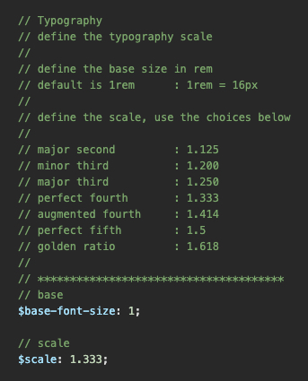
Typography sizes are based on a modular scale ratio, written by Tim Brown. There are seven scale ratios to choose from in Tailspin. They do not require breakpoints for responsive sizing since the use of the clamp() CSS function allows controlled scaling of the typography sizes as the viewport width is increased or decreased.
Default modular scale ratio is 1.333 (Perfect Fourth). Resize the browser to see the scaling in action.
Define the base font size and modular scale.
Base font size is 1 : 1rem = 16px
Default modular scale is 1.333 (Perfect Fourth)
Only the typography size is controlled, other properties are not included.
h1 - This is an H1 heading
h2 - This is an H2 heading
h3 - This is an H3 heading
h4 - This is an H4 heading
h5 - This is an H5 heading
h6 - This is an H6 heading
p - This is a paragraph
small - This is small text
Font Size
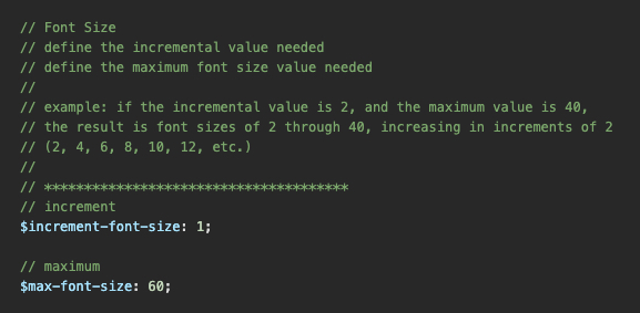
Not to be confused with typography, Font Size produces a class system that controls the sizing of text. Font Size classes support responsive breakpoints for tablet and phone viewport widths.
Pixel units are converted to rem units when compiled : 1rem = 16px
Define the incremental value and maximum value for font sizes.
If the incremental value is 5, and the maximum font size is 20, the CSS output will produce font sizes starting at 5, and ending at 20. The sizes will increase by a value of 5 until the maxiumum is reached. The larger the maxiumum value is, the more CSS rules are created. This creates a larger CSS file disc size. Be cautious how many sizes are needed.
In the example below, the result would be: 1px, 2px, 3px, 4px, 5px, 6px ... 59px, 60px.
The following example will apply a font size of 32px to the paragraph, a font size of 20px to the paragraph on a tablet size breakpoint, and a font size of 16px to the paragraph on a phone size breakpoint.
Code
<p class="font-size-32 tablet-font-size-20 phone-font-size-16">
   Lorem ipsum dolor sit amet consectetur adipiscing elit.
</p>
Result
Lorem ipsum dolor sit amet consectetur adipiscing elit.
Supported class name patterns:
Desktop to phone
font-size-[value]
Tablet to phone
tablet-font-size-[value]
Phone
phone-font-size-[value]
Margin
Margin produces a class system that controls the top, bottom, left, and right margins. Margin classes also support responsive breakpoints for tablet and phone viewport widths. These classes will override Bootstrap utility classes.
Pixel units are converted to rem units when compiled : 1rem = 16px
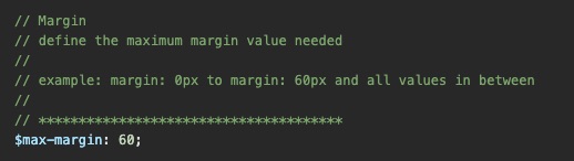
Define the maximum value for the amount of margin sizes needed.
If the maximum value is 10, there will only be 11 margin rules created. Starting from 0px, which increases by 1px, until 10px is reached. The larger the maxiumum value is, the more CSS rules are created. This creates a larger CSS file disc size. Be cautious how many sizes are needed.
The following example will add 30 pixels of margin to the left and right sides of the div block, then 10 pixels of margin on a tablet size breakpoint, then zero pixels of margin on a phone size breakpoint.
Code
<div class="margin-left-right-30 tablet-margin-left-right-10 phone-margin-0">
   Lorem ipsum dolor sit amet consectetur adipiscing elit.
</div>
Result
Supported naming patterns:
Desktop to phone
margin-[value]
margin-top-[value]
margin-bottom-[value]
margin-top-bottom-[value]
margin-left-[value]
margin-right-[value]
margin-left-right-[value]
Tablet to phone
tablet-margin-[value]
tablet-margin-top-[value]
tablet-margin-bottom-[value]
tablet-margin-top-bottom-[value]
tablet-margin-left-[value]
tablet-margin-right-[value]
tablet-margin-left-right-[value]
Phone
phone-margin-[value]
phone-margin-top-[value]
phone-margin-bottom-[value]
phone-margin-top-bottom-[value]
phone-margin-left-[value]
phone-margin-right-[value]
phone-margin-left-right-[value]
Padding
Padding produces a class system that controls the top, bottom, left, and right padding. Padding classes also support responsive breakpoints for tablet and phone viewport widths. These classes will override Bootstrap utility classes.
Pixel units are converted to rem units when compiled : 1rem = 16px
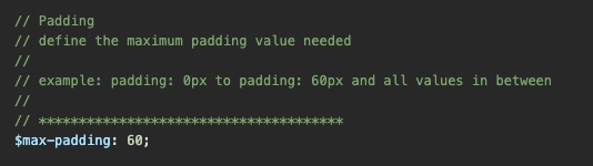
Define the maximum value for the amount of padding sizes needed.
If the maximum value is 20, there will only be 21 padding rules created. Starting from 0px, which increases by 1px, until 20px is reached. The larger the maxiumum value is, the more CSS rules are created. This creates a larger CSS file disc size. Be cautious how many sizes are needed.
The following example will add 45 pixels of padding to the div block, then 20 pixels of padding to the top and bottom, leaving 45 pixels to the left and right of the div block, on a tablet size breakpoint. Then 10 pixels of padding to the top and bottom, leaving 45 pixels to the left and right of the div block, on a phone size breakpoint.
Code
<div class="padding-45 tablet-padding-top-bottom-20 phone-padding-top-bottom-10">
   Lorem ipsum dolor sit amet consectetur adipiscing elit.
</div>
Result
Supported naming patterns:
Desktop to phone
padding-[value]
padding-top-[value]
padding-bottom-[value]
padding-top-bottom-[value]
padding-left-[value]
padding-right-[value]
padding-left-right-[value]
Tablet to phone
tablet-padding-[value]
tablet-padding-top-[value]
tablet-padding-bottom-[value]
tablet-padding-top-bottom-[value]
tablet-padding-left-[value]
tablet-padding-right-[value]
tablet-padding-left-right-[value]
Phone
phone-padding-[value]
phone-padding-top-[value]
phone-padding-bottom-[value]
phone-padding-top-bottom-[value]
phone-padding-left-[value]
phone-padding-right-[value]
phone-padding-left-right-[value]
Responsive Tables
Settings and classes for styling responsive tables and table elements. These classes will override Bootstrap table classes.
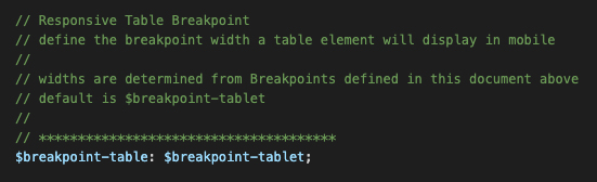
Define the responsive breakpoint that tables will support mobile device widths.
Supported table class names:
table
table-dark
table-stripped
table-centered
Supported breakpoint names:
$breakpoint-desktop-large
$breakpoint-desktop-medium
$breakpoint-desktop-small
$breakpoint-tablet
$breakpoint-phone-extralarge
$breakpoint-phone-large
$breakpoint-phone-medium
$breakpoint-phone-small
Default Table
Code
<table class="table">
   <caption>Default Table Caption</caption>
   <thead>
      <tr>
         <th scope="col">Table head 1</th>
         <th scope="col">Table head 2</th>
         <th scope="col">Table head 3</th>
         <th scope="col">Table head 4</th>
         <th scope="col">Table head 5</th>
      </tr>
   </thead>
   <tbody>
      <tr>
         <td data-label="Table head 1">Table cell 1</td>
         <td data-label="Table head 2">Table cell 2</td>
         <td data-label="Table head 3">Table cell 3</td>
         <td data-label="Table head 4">Table cell 4</td>
         <td data-label="Table head 5">Table cell 5</td>
      </tr>
      <tr>
         <td scope="row" data-label="Table head 1">Table cell 1</td>
         <td data-label="Table head 2">Table cell 2</td>
         <td data-label="Table head 3">Table cell 3</td>
         <td data-label="Table head 4">Table cell 4</td>
         <td data-label="Table head 5">Table cell 5</td>
      </tr>
   </tbody>
</table>
Result
| Table head 1 | Table head 2 | Table head 3 | Table head 4 | Table head 5 |
|---|---|---|---|---|
| Table cell 1 | Table cell 2 | Table cell 3 | Table cell 4 | Table cell 5 |
| Table cell 1 | Table cell 2 | Table cell 3 | Table cell 4 | Table cell 5 |
| Table cell 1 | Table cell 2 | Table cell 3 | Table cell 4 | Table cell 5 |
| Table cell 1 | Table cell 2 | Table cell 3 | Table cell 4 | Table cell 5 |
| Table cell 1 | Table cell 2 | Table cell 3 | Table cell 4 | Table cell 5 |
Stripped Table
Code
<table class="table table-stripped">
   <thead>
      <tr>
         <th scope="col">Table head 1</th>
         <th scope="col">Table head 2</th>
         <th scope="col">Table head 3</th>
         <th scope="col">Table head 4</th>
         <th scope="col">Table head 5</th>
      </tr>
   </thead>
   <tbody>
      <tr>
         <td data-label="Table head 1">Table cell 1</td>
         <td data-label="Table head 2">Table cell 2</td>
         <td data-label="Table head 3">Table cell 3</td>
         <td data-label="Table head 4">Table cell 4</td>
         <td data-label="Table head 5">Table cell 5</td>
      </tr>
      <tr>
         <td scope="row" data-label="Table head 1">Table cell 1</td>
         <td data-label="Table head 2">Table cell 2</td>
         <td data-label="Table head 3">Table cell 3</td>
         <td data-label="Table head 4">Table cell 4</td>
         <td data-label="Table head 5">Table cell 5</td>
      </tr>
      <tr>
         <td scope="row" data-label="Table head 1">Table cell 1</td>
         <td data-label="Table head 2">Table cell 2</td>
         <td data-label="Table head 3">Table cell 3</td>
         <td data-label="Table head 4">Table cell 4</td>
         <td data-label="Table head 5">Table cell 5</td>
      </tr>
   </tbody>
</table>
Result
| Table head 1 | Table head 2 | Table head 3 | Table head 4 | Table head 5 |
|---|---|---|---|---|
| Table cell 1 | Table cell 2 | Table cell 3 | Table cell 4 | Table cell 5 |
| Table cell 1 | Table cell 2 | Table cell 3 | Table cell 4 | Table cell 5 |
| Table cell 1 | Table cell 2 | Table cell 3 | Table cell 4 | Table cell 5 |
| Table cell 1 | Table cell 2 | Table cell 3 | Table cell 4 | Table cell 5 |
| Table cell 1 | Table cell 2 | Table cell 3 | Table cell 4 | Table cell 5 |
Default Dark Table
Code
<table class="table table-dark">
   <thead>
      <tr>
         <th scope="col">Table head 1</th>
         <th scope="col">Table head 2</th>
         <th scope="col">Table head 3</th>
         <th scope="col">Table head 4</th>
         <th scope="col">Table head 5</th>
      </tr>
   </thead>
   <tbody>
      <tr>
         <td data-label="Table head 1">Table cell 1</td>
         <td data-label="Table head 2">Table cell 2</td>
         <td data-label="Table head 3">Table cell 3</td>
         <td data-label="Table head 4">Table cell 4</td>
         <td data-label="Table head 5">Table cell 5</td>
      </tr>
      <tr>
         <td scope="row" data-label="Table head 1">Table cell 1</td>
         <td data-label="Table head 2">Table cell 2</td>
         <td data-label="Table head 3">Table cell 3</td>
         <td data-label="Table head 4">Table cell 4</td>
         <td data-label="Table head 5">Table cell 5</td>
      </tr>
      <tr>
         <td scope="row" data-label="Table head 1">Table cell 1</td>
         <td data-label="Table head 2">Table cell 2</td>
         <td data-label="Table head 3">Table cell 3</td>
         <td data-label="Table head 4">Table cell 4</td>
         <td data-label="Table head 5">Table cell 5</td>
      </tr>
   </tbody>
</table>
Result
| Table head 1 | Table head 2 | Table head 3 | Table head 4 | Table head 5 |
|---|---|---|---|---|
| Table cell 1 | Table cell 2 | Table cell 3 | Table cell 4 | Table cell 5 |
| Table cell 1 | Table cell 2 | Table cell 3 | Table cell 4 | Table cell 5 |
| Table cell 1 | Table cell 2 | Table cell 3 | Table cell 4 | Table cell 5 |
| Table cell 1 | Table cell 2 | Table cell 3 | Table cell 4 | Table cell 5 |
| Table cell 1 | Table cell 2 | Table cell 3 | Table cell 4 | Table cell 5 |
Stripped Dark Table
Code
<table class="table table-dark table-stripped">
   <thead>
      <tr>
         <th scope="col">Table head 1</th>
         <th scope="col">Table head 2</th>
         <th scope="col">Table head 3</th>
         <th scope="col">Table head 4</th>
         <th scope="col">Table head 5</th>
      </tr>
   </thead>
   <tbody>
      <tr>
         <td data-label="Table head 1">Table cell 1</td>
         <td data-label="Table head 2">Table cell 2</td>
         <td data-label="Table head 3">Table cell 3</td>
         <td data-label="Table head 4">Table cell 4</td>
         <td data-label="Table head 5">Table cell 5</td>
      </tr>
      <tr>
         <td scope="row" data-label="Table head 1">Table cell 1</td>
         <td data-label="Table head 2">Table cell 2</td>
         <td data-label="Table head 3">Table cell 3</td>
         <td data-label="Table head 4">Table cell 4</td>
         <td data-label="Table head 5">Table cell 5</td>
      </tr>
      <tr>
         <td scope="row" data-label="Table head 1">Table cell 1</td>
         <td data-label="Table head 2">Table cell 2</td>
         <td data-label="Table head 3">Table cell 3</td>
         <td data-label="Table head 4">Table cell 4</td>
         <td data-label="Table head 5">Table cell 5</td>
      </tr>
   </tbody>
</table>
Result
| Table head 1 | Table head 2 | Table head 3 | Table head 4 | Table head 5 |
|---|---|---|---|---|
| Table cell 1 | Table cell 2 | Table cell 3 | Table cell 4 | Table cell 5 |
| Table cell 1 | Table cell 2 | Table cell 3 | Table cell 4 | Table cell 5 |
| Table cell 1 | Table cell 2 | Table cell 3 | Table cell 4 | Table cell 5 |
| Table cell 1 | Table cell 2 | Table cell 3 | Table cell 4 | Table cell 5 |
| Table cell 1 | Table cell 2 | Table cell 3 | Table cell 4 | Table cell 5 |
Centered Table
Code
<table class="table table-centered">
   <thead>
      <tr>
         <th scope="col">Table head 1</th>
         <th scope="col">Table head 2</th>
         <th scope="col">Table head 3</th>
         <th scope="col">Table head 4</th>
         <th scope="col">Table head 5</th>
      </tr>
   </thead>
   <tbody>
      <tr>
         <td data-label="Table head 1">Table cell 1</td>
         <td data-label="Table head 2">Table cell 2</td>
         <td data-label="Table head 3">Table cell 3</td>
         <td data-label="Table head 4">Table cell 4</td>
         <td data-label="Table head 5">Table cell 5</td>
      </tr>
      <tr>
         <td scope="row" data-label="Table head 1">Table cell 1</td>
         <td data-label="Table head 2">Table cell 2</td>
         <td data-label="Table head 3">Table cell 3</td>
         <td data-label="Table head 4">Table cell 4</td>
         <td data-label="Table head 5">Table cell 5</td>
      </tr>
      <tr>
         <td scope="row" data-label="Table head 1">Table cell 1</td>
         <td data-label="Table head 2">Table cell 2</td>
         <td data-label="Table head 3">Table cell 3</td>
         <td data-label="Table head 4">Table cell 4</td>
         <td data-label="Table head 5">Table cell 5</td>
      </tr>
   </tbody>
</table>
Result
| Table head 1 | Table head 2 | Table head 3 | Table head 4 | Table head 5 |
|---|---|---|---|---|
| Table cell 1 | Table cell 2 | Table cell 3 | Table cell 4 | Table cell 5 |
| Table cell 1 | Table cell 2 | Table cell 3 | Table cell 4 | Table cell 5 |
| Table cell 1 | Table cell 2 | Table cell 3 | Table cell 4 | Table cell 5 |
| Table cell 1 | Table cell 2 | Table cell 3 | Table cell 4 | Table cell 5 |
| Table cell 1 | Table cell 2 | Table cell 3 | Table cell 4 | Table cell 5 |
Z-Index
Z-Index produces a class system that dictates the z-index, or position order of an element. Z-Index classes also support responsive breakpoints for tablet and phone viewport widths. These classes will override Bootstrap utility classes.
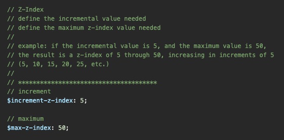
Define the incremental value and maximum value for z-index position orders.
If the incremental value is 3, and the maxiumum value is 24, the CSS output will produce z-index values starting at 3, and ending at 24. The values will increae by 3 until the maximum value is reached. The larger the maxiumum value is, the more CSS rules are created. This creates a larger CSS file disc size. Be cautious how many sizes are needed.
In the example below, the result would be: 5, 10, 15, 20, 25 ... 45, 50.
The following example will add z-index of 15 to the blue div block, then a z-index of 5 to the blue div block on a tablet and phone size breakpoint. The red div block will use a constant z-index of 10. Resize the browser to observe the blue div block stack underneath the red div block at tablet and phone size breakpoint widths.
Code
<div class="z-index-15 tablet-z-index-5">
   Blue block
</div>

<div class="z-index-10">
   Red block
</div>
Result
Supported class name patterns:
Desktop to phone
z-index-[value]
Tablet to phone
tablet-z-index-[value]
Phone
phone-z-index-[value]
Border Radius
Border Radius produces a class system that adds a border radius to an element. The classes also support responsive breakpoints for tablet and phone viewport widths. These classes will override Bootstrap utility classes.
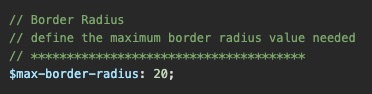
Define the maximum value for border radius.
If the maxiumum value is 20, the CSS output will produce a border radius value starting at 1, and ending at 20, with all values in between.
In the example below, the result would be: 1, 2, 3, 4, 5 ... 19, 20.
The following example will add a border radius of 3 to the div block, a border radius of 13 to the div block on a tablet size breakpoint, and a border radius of 6 to the div block on a phone size breakpoint.
Code
<div class="border-radius-3 tablet-border-radius-6 phone-border-radius-2">
   Lorem ipsum dolor sit amet consectetur adipiscing elit.
</div>
Result
Supported class name patterns:
Desktop to phone
border-radius-[value]
Tablet to phone
tablet-border-radius-[value]
Phone
phone-border-radius-[value]
Borders, Default Border Color, & Circles (Utilities)
The border utility produces a class system to add a border to any element. The classes support responsive breakpoints for tablet and phone viewport widths. The Default Border Color controls the color for all borders, however the utility does not override Bootstrap utility classes. The circle utility produces a class to transform an elenent into a full circle, with support for tablet and phone breakpoint widths.
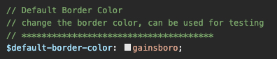
Define the border color with a hex value or supported color name.
The starting Tailspin color name is 'gainsboro'.
The following examples will add a border, with a border radius of 10 to the first div block, and transform the second div block into a circle.
Code
<div class="border border-radius-10">
   Lorem ipsum dolor sit amet consectetur adipiscing elit.
</div>

<div class="border border-radius-circle">
   Circle
</div>
Result
Supported class name patterns:
Desktop to phone
border
border-top
border-bottom
border-left
border-right
border-radius-circle
Tablet to phone
tablet-border
tablet-border-top
tablet-border-bottom
tablet-border-left
tablet-border-right
tablet-border-radius-circle
Phone
phone-border
phone-border-top
phone-border-bottom
phone-border-left
phone-border-right
phone-border-radius-circle
Centering (Utilities)
This utility class system allows an element to be centered horizontally, vertically, or both, providing the parent containing block element has dimension and a relative position. The classes also support responsive breakpoints for tablet and phone viewport widths.
It is important to remember the centering utility classes will not work unless the parent block container has a width, a height, and a relative position.
The following example will transform a div block element into a circle, and center the text inside horiztonally and vertically using a centering utility class.
Code
<div class="border-radius-circle" style="height: 100px; width: 100px; position: relative;">
   <span class="center-both">Circle</span>
</div>
Result
Supported class name patterns:
Desktop to phone
center-vert
center-horz
center-both
Tablet to phone
tablet-center-vert
tablet-center-horz
tablet-center-both
Phone
phone-center-vert
phone-center-horz
phone-center-both
Clipping (Utilities)
This utility class system applies an overflow to any element. Overflow is used when an element's content is too large to fit within its block formatting context. The classes also support responsive breakpoints for tablet and phone viewport widths.
Pro Tip 1
Add overflow-y: scroll; to the HTML element in your CSS.
This prevents the scrollbar area on the side of the browser from disappearing and reappearing with interactivity, such as a modal window or full screen element with a fixed position.
Pro Tip 2
Add -webkit-overflow-scrolling: touch; to an element that uses an overflow rule that enables a scrollbar. This will initiate smooth momentum scrolling on IOS devices.
The following example applies a vertical overflow to a div block element, that allows a scrollbar to control content flow.
Code
<div class="overflow-vertical-auto">
   Lorem ipsum dolor sit amet consectetur adipiscing elit. Mauris dictum arcu lacus ...
</div>
Result
Supported class name patterns:
Desktop to phone
overflow-hidden
overflow-auto
overflow-scroll
overflow-horizontal-hidden
overflow-horizontal-auto
overflow-horizontal-scroll
overflow-vertical-hidden
overflow-vertical-auto
overflow-vertical-scroll
Tablet to phone
tablet-overflow-hidden
tablet-overflow-auto
tablet-overflow-scroll
tablet-overflow-horizontal-hidden
tablet-overflow-horizontal-auto
tablet-overflow-horizontal-scroll
tablet-overflow-vertical-hidden
tablet-overflow-vertical-auto
tablet-overflow-vertical-scroll
Phone
phone-overflow-hidden
phone-overflow-auto
phone-overflow-scroll
phone-overflow-horizontal-hidden
phone-overflow-horizontal-auto
phone-overflow-horizontal-scroll
phone-overflow-vertical-hidden
phone-overflow-vertical-auto
phone-overflow-vertical-scroll
Display (Utilities)
The Display utility classes will determine if an element is treated as a block or inline level element. The classes also support responsive breakpoints for tablet and phone viewport widths.
Pro Tip
When using JavaScript with elements that are set to display: none, avoid the Tailspin display utility classes as they may override the intended JavaScript code.
The following example uses responsive breakpoints to change the Display property of the <div> blocks. Since a <div> is, by default, a block level element, the desktop breakpoint class is not needed. Resize the browser to see the display utility classes in action.
Code
<div class="tablet-display-inline">
   Div Block 1
</div>

<div class="tablet-display-inline">
   Div Block 2
</div>

<div class="tablet-display-inline phone-display-none">
   Div Block 3
</div>
Result
Supported class name patterns:
Desktop to phone
display-block
display-block-inline
display-inline
display-none
Tablet to phone
tablet-display-block
tablet-display-block-inline
tablet-display-inline
tablet-display-none
Phone
phone-display-block
phone-display-block-inline
phone-display-inline
phone-display-none
Flex Properties (Utilities)
Flex
Flex utility classes define a flex container's display property. Commonly referred as Flexbox, these classes enable alignment of items on the main-axis or cross-axis of a container. The classes also support responsive breakpoints for tablet and phone viewport widths.
Pro Tip
Flexbox is a one-dimensional layout method and flex items can be allowed to wrap but, once they do, each line becomes a flex container of its own. When space is distributed flexbox does not look at the placement of items in other rows and tries to line things up with each other.
The following example uses responsive breakpoints to change the Flex property of the <div> blocks container. Resize the browser to see the flex utility classes in action.
Code
<div class="display-flex-inline tablet-display-flex phone-display-flex-inline">
   <div>
      Div Block 1
   </div>

   <div>
      Div Block 2
   </div>

   <div>
      Div Block 3
   </div>
</div>
Result
Supported class name patterns:
Desktop to phone
display-flex
display-flex-inline
Tablet to phone
tablet-display-flex
tablet-display-flex-inline
Phone
phone-display-flex
phone-display-flex-inline
Flex Direction
Flex Direction utility classes will set how flex items are placed in a flex container defining the main-axis and the direction, either normal or reversed. The classes also support responsive breakpoints for tablet and phone viewport widths.
Pro Tip
Combine Flex Direction with JavaScript to create a simple sorting mechanism.
Example
Item 1
Item 2
Item 3
Item 4
Item 5
flex-column
The following example uses responsive breakpoints to change the Flex Direction property of the <div> blocks container. Resize the browser to see the flex direction utility classes in action.
Code
<div class="flex-row tablet-flex-column phone-flex-row-reverse">
   <div>
      Div Block 1
   </div>

   <div>
      Div Block 2
   </div>

   <div>
      Div Block 3
   </div>
</div>
Result
Supported class name patterns:
Desktop to phone
flex-row
flex-row-reverse
flex-column
flex-column-reverse
Tablet to phone
tablet-flex-row
tablet-flex-row-reverse
tablet-flex-column
tablet-flex-column-reverse
Phone
phone-flex-row
phone-flex-row-reverse
phone-flex-column
phone-flex-column-reverse
Flex Wrap
Flex Wrap utility classes set whether flex items are forced onto one line or can wrap onto multiple lines. If wrapping is allowed, it sets the direction that lines are stacked. The classes also support responsive breakpoints for tablet and phone viewport widths.
Pro Tip
Use Flex Wrap on a container to quickly allow or prevent child elements, that may not fit into a single row, to cascade freely when the parent container is resized.
The following example uses responsive breakpoints to change the Flex Wrap property of the <div> blocks container. Setting the tablet responsive breakpoint to tablet-flex-no-wrap demonstrates how this will break the layout if flex wrapping is disabled. Resize the browser to see the flex wrap utility classes in action.
Code
<div class="flex-wrap-reverse tablet-flex-no-wrap phone-flex-wrap">
   <div>
      Div Block 1
   </div>

   <div>
      Div Block 2
   </div>

   <div>
      Div Block 3
   </div>

   <div>
      Div Block 4
   </div>

   <div>
      Div Block 5
   </div>

   <div>
      Div Block 6
   </div>

   <div>
      Div Block 7
   </div>

   <div>
      Div Block 8
   </div>

   <div>
      Div Block 9
   </div>
</div>
Result
Supported class name patterns:
Desktop to phone
flex-wrap
flex-wrap-reverse
flex-no-wrap
Tablet to phone
tablet-flex-wrap
tablet-flex-wrap-reverse
tablet-flex-no-wrap
Phone
phone-flex-wrap
phone-flex-wrap-reverse
phone-flex-no-wrap
Justify Content
Justify Content utility classes define how the browser distributes space between and around content items along the main-axis of a flex container. The classes also support responsive breakpoints for tablet and phone viewport widths.
The following example uses responsive breakpoints to change the Justify Content property of the <div> blocks container. Resize the browser to see the justify content utility classes in action.
Code
<div class="justify-content-between tablet-justify-content-center">
   <div>
      Div Block 1
   </div>

   <div>
      Div Block 2
   </div>

   <div>
      Div Block 3
   </div>
</div>
Result
Supported class name patterns:
Desktop to phone
justify-content-start
justify-content-end
justify-content-center
justify-content-space-between
justify-content-space-around
justify-content-space-evenly
Tablet to phone
tablet-justify-content-start
tablet-justify-content-end
tablet-justify-content-center
tablet-justify-content-space-between
tablet-justify-content-space-around
tablet-justify-content-space-evenly
Phone
phone-justify-content-start
phone-justify-content-end
phone-justify-content-center
phone-justify-content-space-between
phone-justify-content-space-around
phone-justify-content-space-evenly
Align Items
Align Items utility classes sets the Align Self value on all direct children as a group, and controls the alignment of items on flexbox's cross-axis. The classes also support responsive breakpoints for tablet and phone viewport widths.
The following example uses responsive breakpoints to change the Align Items property of the <div> blocks container. Resize the browser to see the justify content utility classes in action.
Code
<div class="justify-content-between tablet-justify-content-center">
   <div>
      Div Block 1
   </div>

   <div>
      Div Block 2
   </div>

   <div>
      Div Block 3
   </div>
</div>
Result
Supported class name patterns:
Desktop to phone
align-items-start
align-items-end
align-items-center
align-items-baseline
align-items-stretch
Tablet to phone
tablet-align-items-start
tablet-align-items-end
tablet-align-items-center
tablet-align-items-baseline
tablet-align-items-stretch
Phone
phone-align-items-start
phone-align-items-end
phone-align-items-center
phone-align-items-baseline
phone-align-items-stretch
Align Self
Align Self utility classes will override any flex item's Align Items value, and will align an item on flexbox's cross-axis. The classes also support responsive breakpoints for tablet and phone viewport widths.
The following example uses responsive breakpoints to change the Align Self property of the individual <div> child blocks. The parent container must have a Flex display property for the Align Self property to work. Resize the browser to see the align self utility classes in action.
Code
<div>
   <div class="align-self-center tablet-align-self-stretch">
      Div Block 1
   </div>

   <div class="align-self-stretch tablet-align-self-center">
      Div Block 2
   </div>

   <div class="align-self-center tablet-align-self-stretch">
      Div Block 3
   </div>
</div>
Result
Supported class name patterns:
Desktop to phone
align-self-start
align-self-end
align-self-center
align-self-baseline
align-self-stretch
Tablet to phone
tablet-align-self-start
tablet-align-self-end
tablet-align-self-center
tablet-align-self-baseline
tablet-align-self-stretch
Phone
phone-align-self-start
phone-align-self-end
phone-align-self-center
phone-align-self-baseline
phone-align-self-stretch
Align Content
Align Content utility classes will property set the distribution of space between and around content items along a flexbox's cross-axis. The classes also support responsive breakpoints for tablet and phone viewport widths.
The following example uses responsive breakpoints to change the Align Content property of the <div> parent container. The container must have a Flex Wrap display property for the Align Content property to work. Resize the browser to see the align self utility classes in action.
Code
<div class="flex-wrap align-content-center tablet-align-content-space-between">
   <div>
      Div Block 1
   </div>

   <div>
      Div Block 2
   </div>

   <div>
      Div Block 3
   </div>
</div>
Result
Supported class name patterns:
Desktop to phone
align-content-start
align-content-end
align-content-center
align-content-space-between
align-content-space-around
align-content-space-evenly
align-content-stretch
Tablet to phone
tablet-align-content-start
tablet-align-content-end
tablet-align-content-center
tablet-align-content-space-between
tablet-align-content-space-around
tablet-align-content-space-evenly
tablet-align-content-stretch
Phone
phone-align-content-start
phone-align-content-end
phone-align-content-center
phone-align-content-space-between
phone-align-content-space-around
phone-align-content-space-evenly
phone-align-content-stretch
Flex Order
Flex Order utility classes allow flex items within a container to have their layout order changed without affecting source order. The classes also support responsive breakpoints for tablet and phone viewport widths.
Pro Tip
Flex Order also applies to elements that are stacked vertically. For example, a card component with an image stacked on top of the body and text, can be re-ordered beneath the body and text at a responsive breakpoint.
Examples
default
The following example displays a flex order of 4 on the first <div> block, which forces the element to the end of the layout reading left to right.
Code
<div class="order-4">
   Div Block 3
</div>

<div class="order-2">
   Div Block 1
</div>

<div class="order-3">
   Div Block 2
</div>
Result
Supported class name patterns:
Desktop to phone
order-[value]
Tablet to phone
tablet-order-[value]
Phone
phone-order-[value]
Ratios (Utilities)
Ratio utility classes help maintain an elements aspect ratio. Adding this class to a block level element will automatically set the height based on the element's width at the ratio specified by the classname. These ratios are fully responsive in maintaining an aspect ratio no matter the viewport width. The classes also support responsive breakpoints for tablet and phone viewport widths.
Ratios are prefect for handling responsive image and video embeds based on the width of the parent container. Resize the browser to see the results scale at smaller viewpoint widths.
Code
<div class="ratio-21x9">
   Ratio 21x9
</div>

<div class="ratio-16x9">
   Ratio 16x9
</div>

<div class="ratio-4x3">
   Ratio 4x3
</div>

<div class="ratio-1x1">
   Ratio 1x1
</div>
Result
Supported class name patterns:
Desktop to phone
ratio-21x9
ratio-16x9
ratio-4x3
ratio-1x1
Tablet to phone
tablet-ratio-21x9
tablet-ratio-16x9
tablet-ratio-4x3
tablet-ratio-1x1
Phone
phone-ratio-21x9
phone-ratio-16x9
phone-ratio-4x3
phone-ratio-1x1
Responsive Helpers (Utilities)
Responsive helpers are utility classes that quickly define if an element is displayed at either a responsive breakpoint for desktop viewport widths or at mobile viewport widths. These classes are display values only, this means the class instructs the element to either be hidden or visible depending on the width of the viewport.
Resize the browser to see results of the responsive helpers working in action.
The following example will display the first div block element when the viewport is a minimum of 992 pixels wide and up, then a second div block element will display when the viewport width is a maximum of 991 pixels wide and below.
Code
<div class="desktop-only">
   Desktop Only
</div>

<div class="mobile-only">
   Mobile Only
</div>
Result
Supported class name patterns:
Desktop to phone
desktop-only
mobile-only
Media Fill to Container (JS & Utilities)
This class relies on a javascript file in order to work.
The purpose of this class is for an image to fill its parent block container's height and width. If the image is wider than it is tall, it will automatically apply the fill-vertically class. If the image is taller than it is wide, it will apply the fill-horizontally class.
As the element becomes responsive, the code runs a function that constantly checks for the height and width values of the image or video, and applies the appropriate class that meets a condition. This makes for a seamless experience as the asset scales to its parent block container's dimensions. There should never be any negative space between the image or video, and its parent container.
The following examples display images that are filled to their parent block container both vertically, and horizontally. The Ratio, Clipping, and Centering classes have been used to set the asset's position, and parent block container's dimension and overflow. However, any height and width dimension can be used on the parent block container.
Code
<div class="ratio-16x9 overflow-hidden" style="width: 300px; position: relative;">
   <img src="https://fpoimg.com/960x540" alt="" class="js-fill-media-to-container center-both">
</div>
Result
Pro Tip
Use the Ratio, Clipping, and Centering classes on the image or video and their parent block container to create a responsively, scalable element with minimal CSS code.
Use with Video
This example uses a video that has a ratio of 16x9. It is wider than it is tall, and once the page is loaded, gets a class of fill-vertically added. The parent div block container does not require a height attribute since the ratio-16x9 class has been added. This element will scale responsively, adjusting the height as the width changes.
Code
<div class="ratio-16x9 overflow-hidden">
   <video autoplay muted loop playsinline="true" src="video/16x9.mp4" class="js-fill-media-to-container center-both"></video>
</div>
This example uses a video that has a ratio of 9x16. It is taller than it is wide, and once the page is loaded, gets a class of fill-horizontally added. The parent div block container has an explicit height value via CSS, and this element will not scale responsively, the height will remain the same as the width changes.
Code
<div class="video-container overflow-hidden">
   <video autoplay muted loop playsinline="true" src="video/9x16.mp4" class="js-fill-media-to-container center-both"></video>
</div>

.video-container {
   height: 300px;
   position: relative;
}
Use with a Banner Background Image
This example uses a background image that has a dimension of 1920 pixels wide by 1496 pixels tall. It is wider than it is tall, and once the page is loaded, the class fill-horizontally gets added. The parent div block container does not require a height or width attribute. Instead, its using a class of ratio-21x9, and since the banner has no width attribute, it will fill 100% the width of its own parent container. This element will scale responsively, adjusting the height as the width changes.
The additional CSS propteries for max-height and min-height insures the banner has a stopping point for maximum and minimum height values. No matter what these values are, the banner image will always fill the container.

<div class="banner-container border ratio-21x9 overflow-hidden">
    <img src="images/image.webp" class="js-fill-media-to-container center-both">
</div>

.banner-container {
    max-height: 600px;
    min-height: 250px;
    margin: 0 auto;
    position: relative;
}
Animations (Helpers)
Animation helpers come in two flavors. The first are group of classes that can be utilized for animations such as fading an element in, or bouncing an element up and down. The second are a group of easing names to add cubic-bezier curvitures.
Animation Classes
Important
Animation classes are meant to help with interactive events. This means the animations only work when they are added to an element by an interactive mechanism. For example, a javascript click event. If a class is already added to en alement when the page loads, the most likely scenario is no animation will happen.
As soon as the animation class is added to an element, a keyframe at-rule animation is played. The animation will only run once.
Supported class names with examples:
Desktop to phone
Animation delays only use the animation-delay CSS property, and will only run once. Do not confuse these classes in combination with transition CSS properties which use transition-delay.
Supported class names with examples:
Desktop to phone
Easing Classes
How it Works
Easing name classes will replace a transition-timing-function CSS property. This property controls the acceleration curve over an animation's duration, or the amount of time it takes to complete the animation.
In the following example, a simple CSS transition animation is applied to a <div> element. The transition CSS properties include a transition-timing-function of 'linear'.
Code
<div class="red-box"></div>

.red-box {
   transition-property: all;
   transition-duration: 0.3s;
   transition-timing-function: linear;
}
If the class easing-in-out-back is added to the <div> element, the transition-timing-function has now changed to the associated easing class name property.
Code
<div class="red-box easing-in-out-back"></div>
Supported class names with examples:
Desktop to phone